Our most recent project is a stockist and retail outlet for a well-known and trusted brand of herbal products. It is most uncommon for stockists to invest in a retail shop and we were more than happy to come up with a concept and business image for such an outlet -- rather the first of its kind.
We came up with this concept and design for the particular premise, including a corporate image that keeps to the branding of the products already so well known, but giving it a modern and up-to-date look for a stockist/retail store. It was important that its members would immediately recognise the brand, feel familiar about going in to get their products, but also attract those unfamiliar with the brand and products to enter the shop, browse around and purchase products.
The concept and design...
 The completed store...
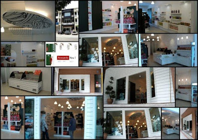
Interior Works:-
Where the counter would be...

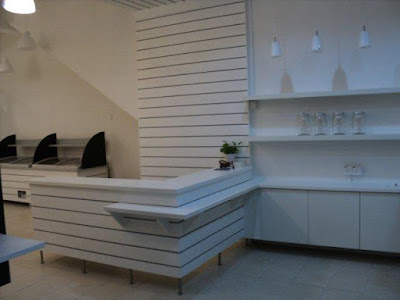
By just cladding the wall with wood, all the way to the overhead canopy, we opened up the space... to get this result.
The drawing...
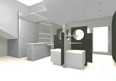 For real...

The counter would service customers who made purchases and the empty wall beside it served to provide a F&B area to sit down, chat and learn more about the products;
Again, an empty wall...
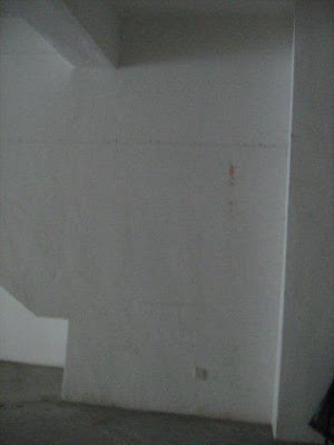 The drawing proposal...
 Now, as part of the service counter, it does more than just let customers pay for their purchases, it becomes an area for a productive social environment -- ask about the products and even sample the products; coffee, cocoa, etc...
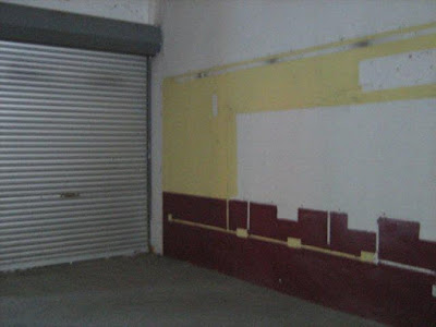
Now for the other side of the wall;
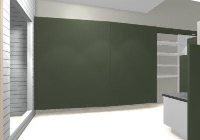
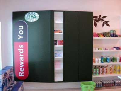
We decided on an info board; to provide information about the products, a place to put brochures and other materials to promote product knowledge.
Here's the drawing proposal...
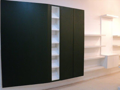
 We used a richer version of their corporate colour green, and after some on-site modifications of adding extra shelving for brochures, it turned out like this...
 Another view of the info board at the shop...
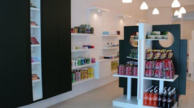 And, this...
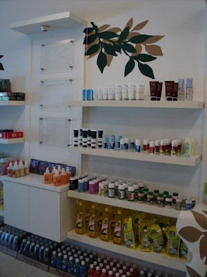
 Now for shelf space to display products...

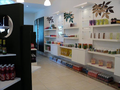
More shelf space in these custom made gondolas.
What we designed...
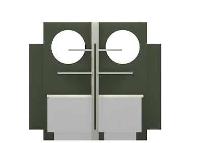 Became these...
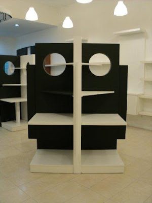 And used like these...
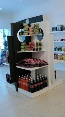
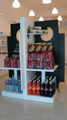
What about space for the chillers; ice cream, frozen food products, and more display?
So, we designed these...
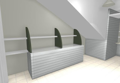 And they turned out like these...
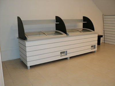 And they became used like these...
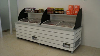
The area at the back of the store became a discussion area, or private area for the owners.

 The design of the private office area...
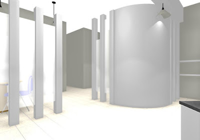
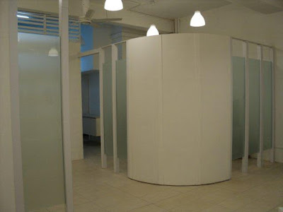
Behind the curved wall...
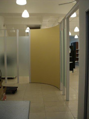
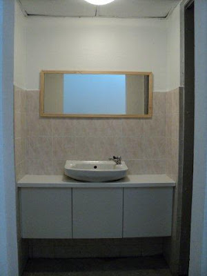
Even the restrooms got a makeover.
This...
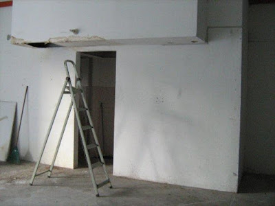 Became this...
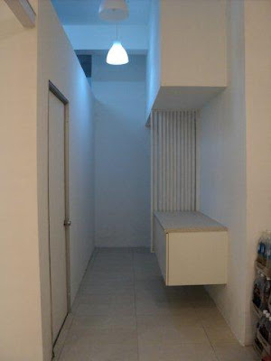 And this...
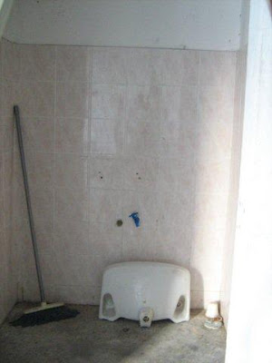 Became this...
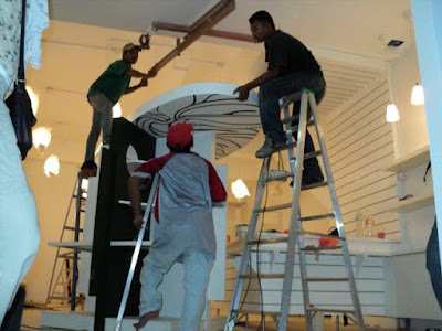
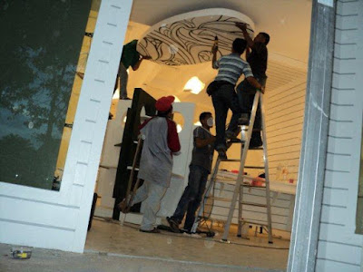
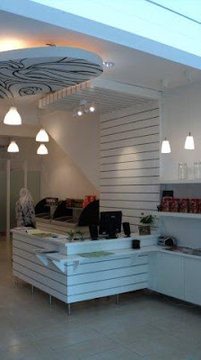
A focal feature for the shop was its overhead artwork; hand drawn and painted. It provided the unconscious placement of the product brand in the mind. Not everyone familiar with the brand recognised it immediately, but after a while its association came to mind.
Here's how it was done...

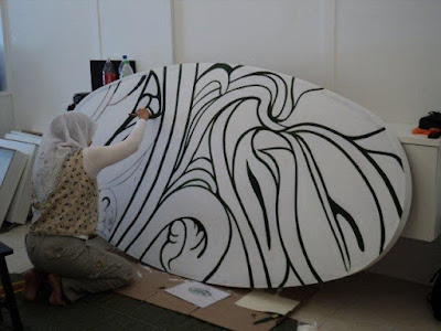
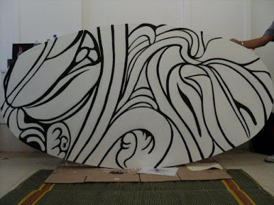 Easy does it...
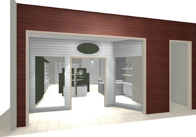
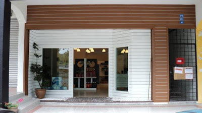
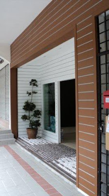
Last but not least, the facade, as the most important feature to attract customers to come in; must be inviting, depicts the products inside, and portrays the owners vision for the products and how it will benefit its customers.
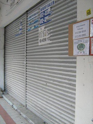
Any ordinary, usual shopfront...
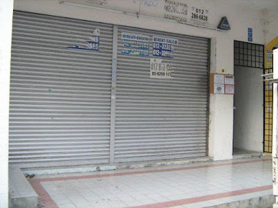 Here's how we wanted it to look like...
 And here's how we made it look like...
 Another view...before...
 And, after...
 And then we finished off with the graphics...
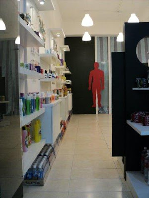 Please come in...
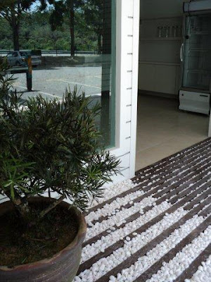 Open for business...
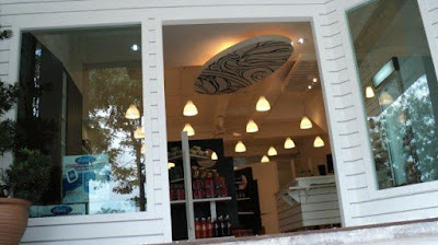 At, Bandar Seri Putra...
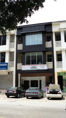 All the best from us...
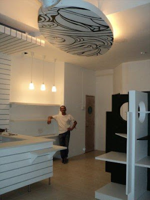
Zahari & Faizah,
Faizah Zainal Lifestyle Design
"Together, we help create your lifestyle -- business or personal."


